Grimshaw
Grimshaw are one of the most prestigious architecture firms in the world, with offices operating globally and over 200 awards for their work.
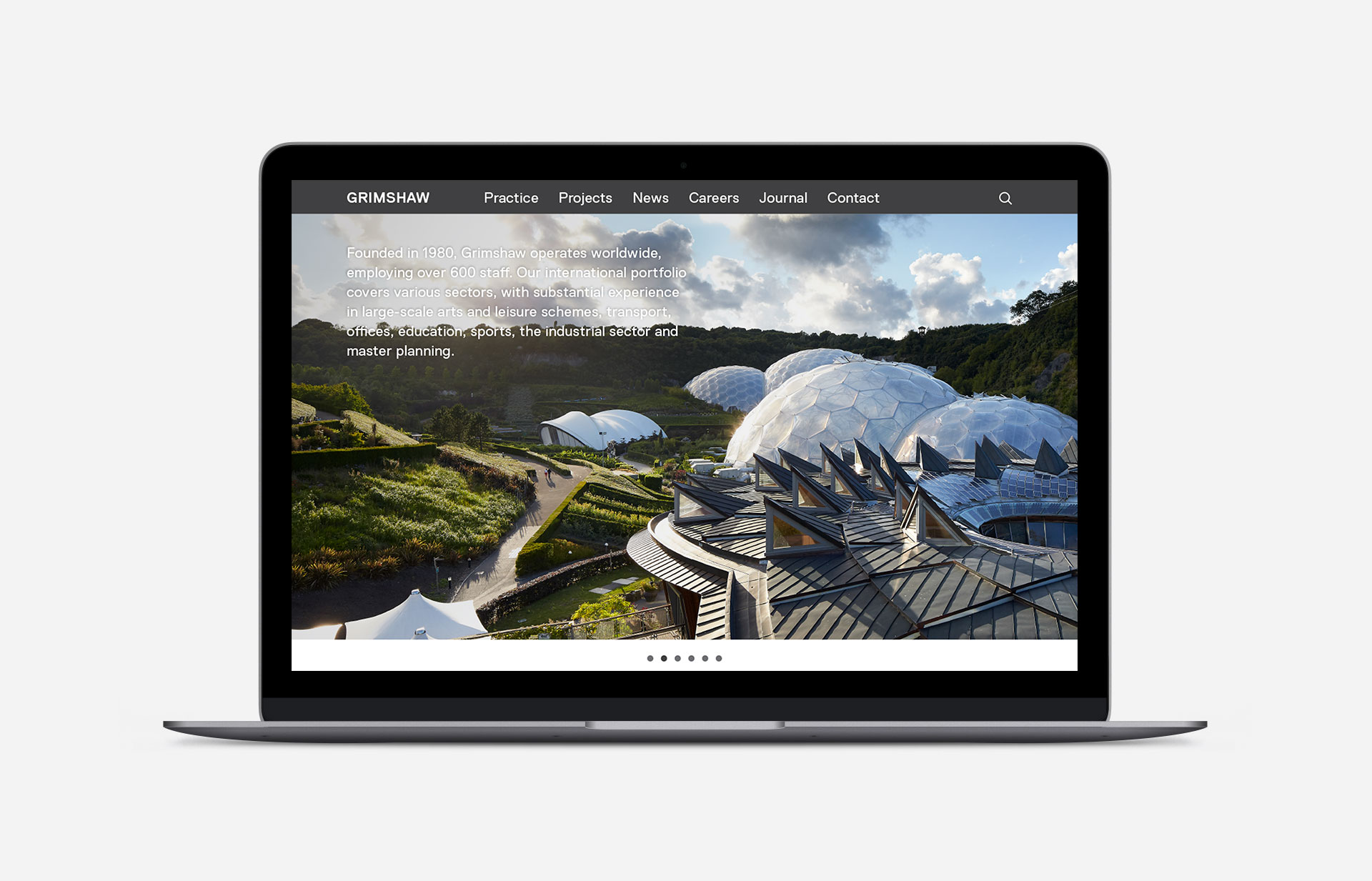
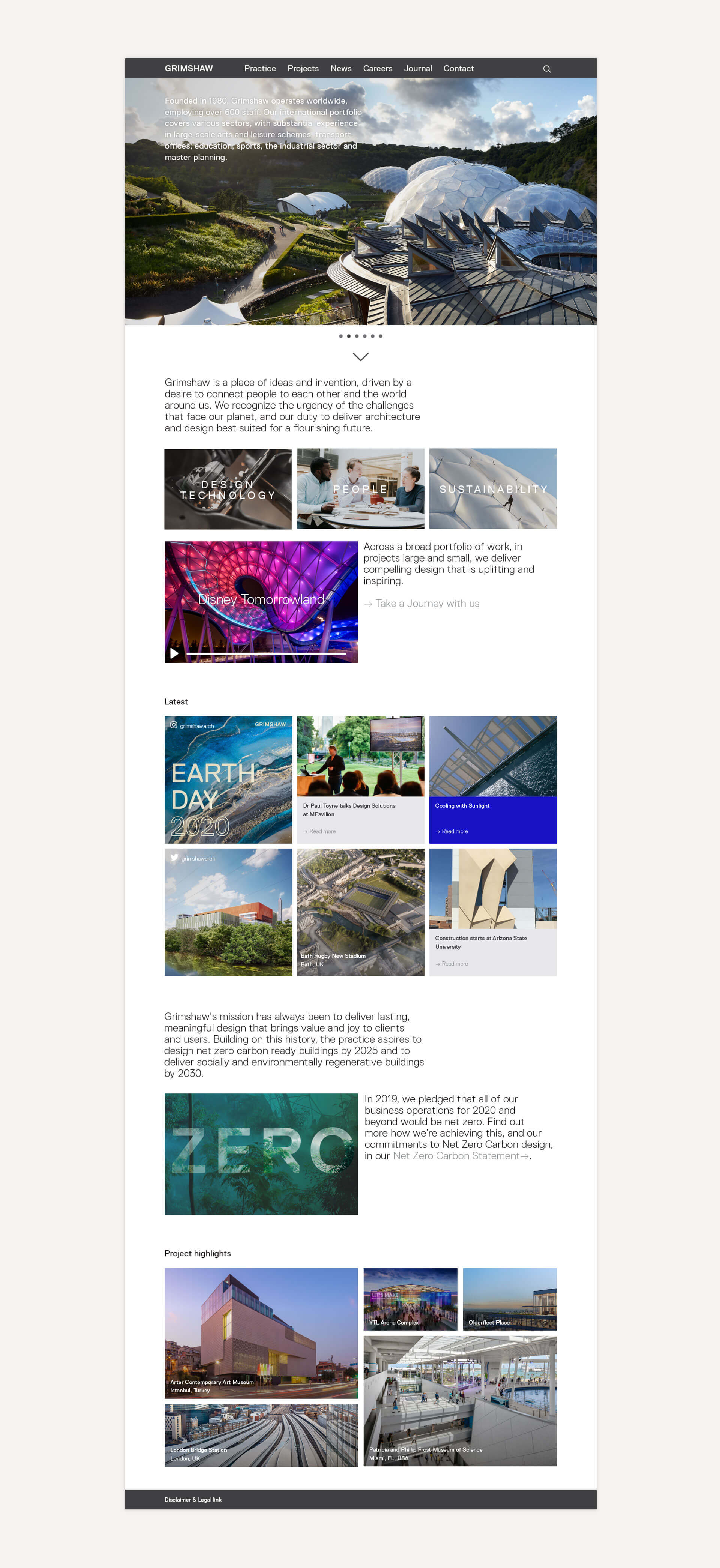
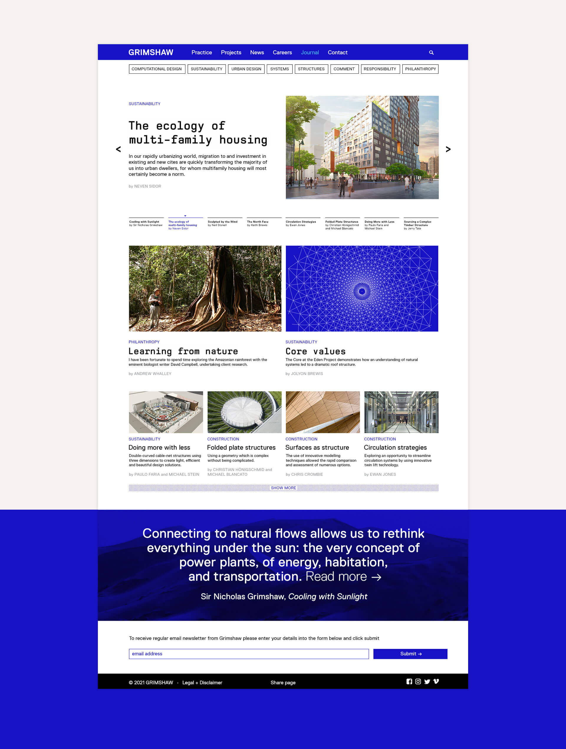
As part of their Graphics team, I took part on the initial rebranding process as well as led their recent website redesign and social media strategy.
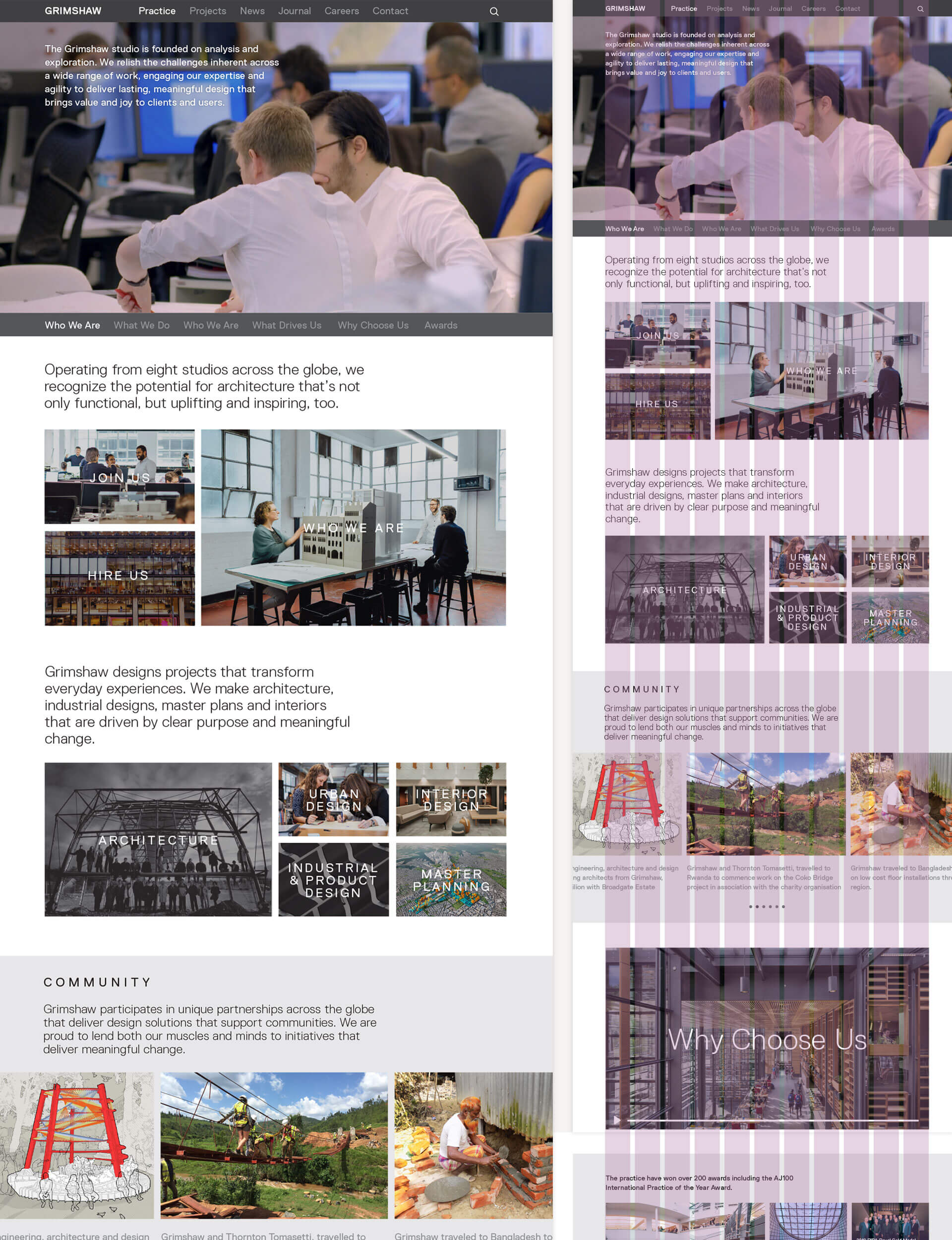
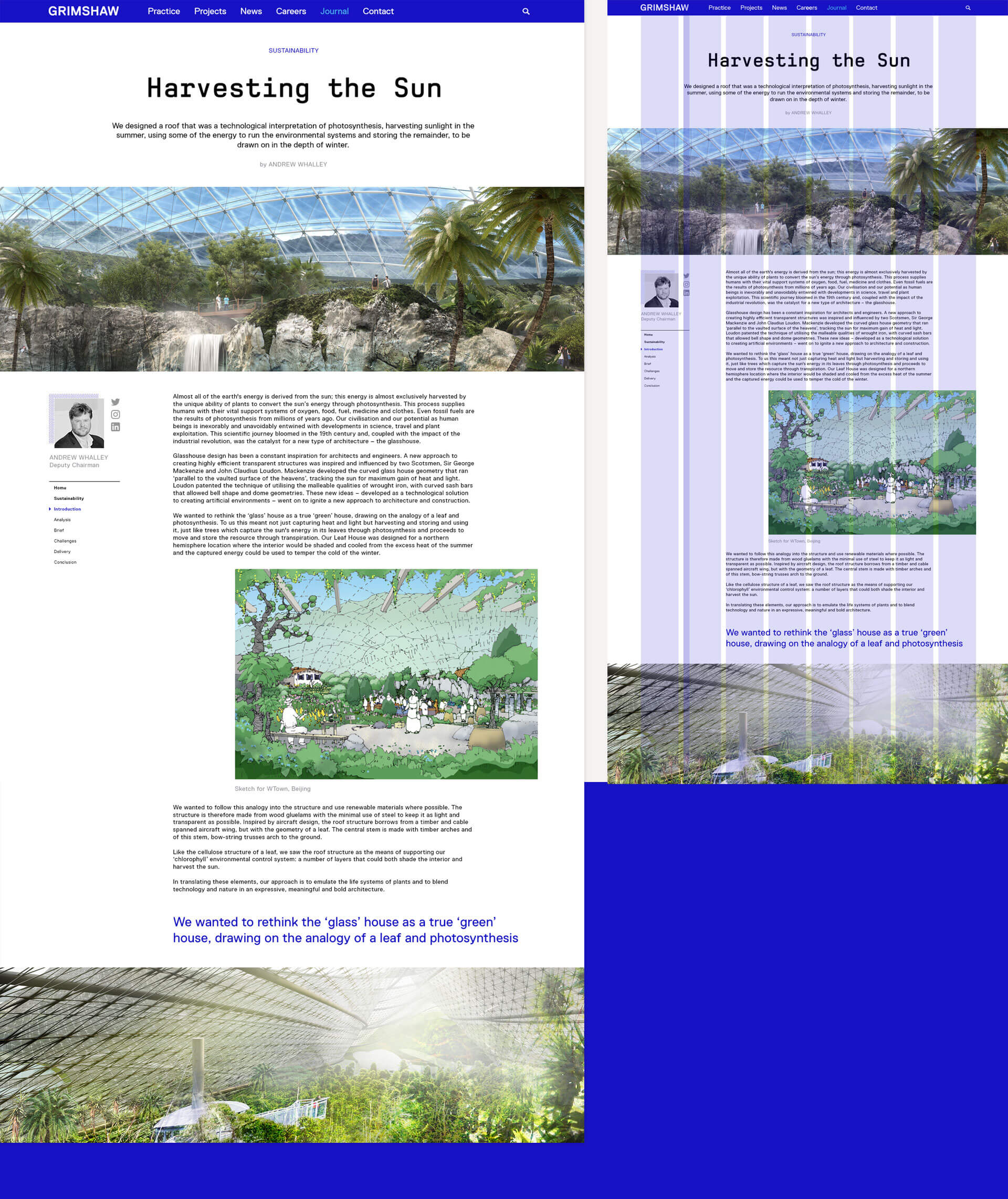
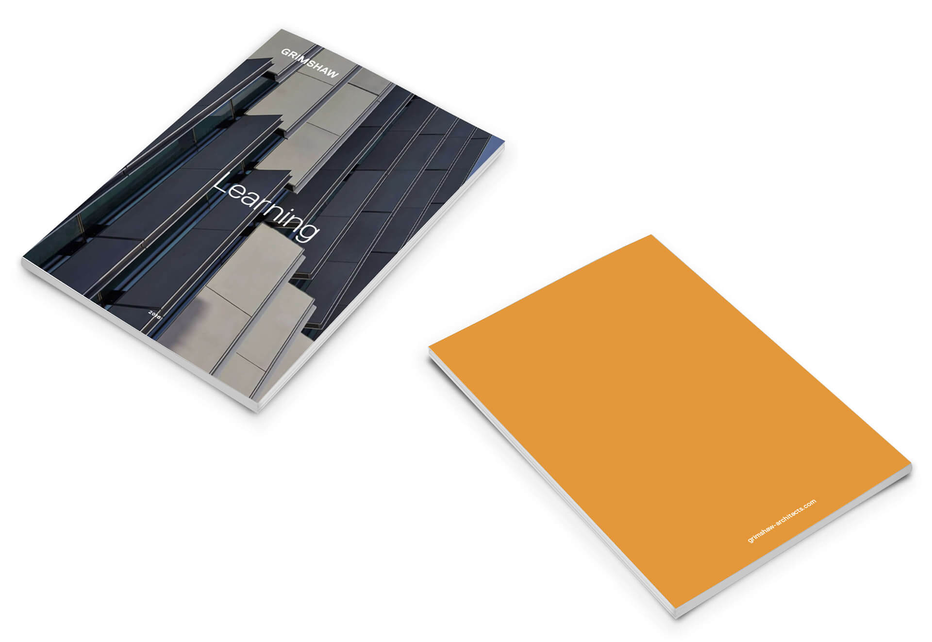
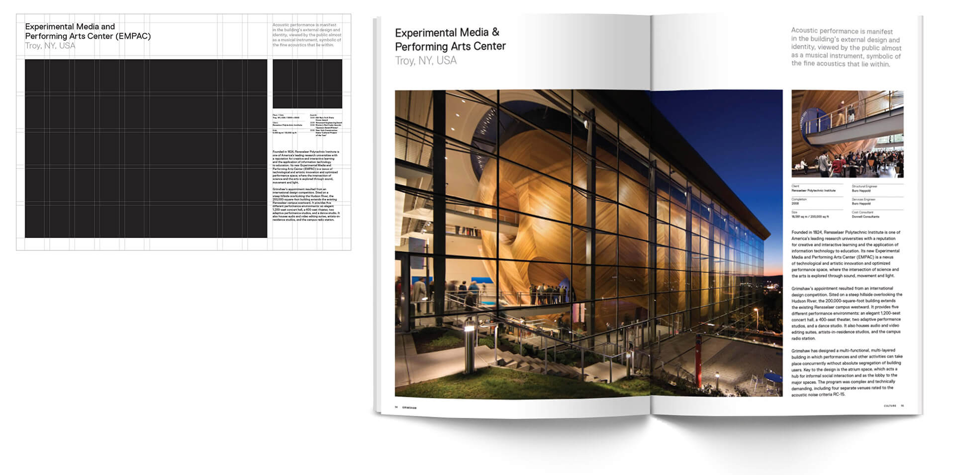
The brand redesign consolidates the design ethos of the firm, using a strong, modular grid and typography system.
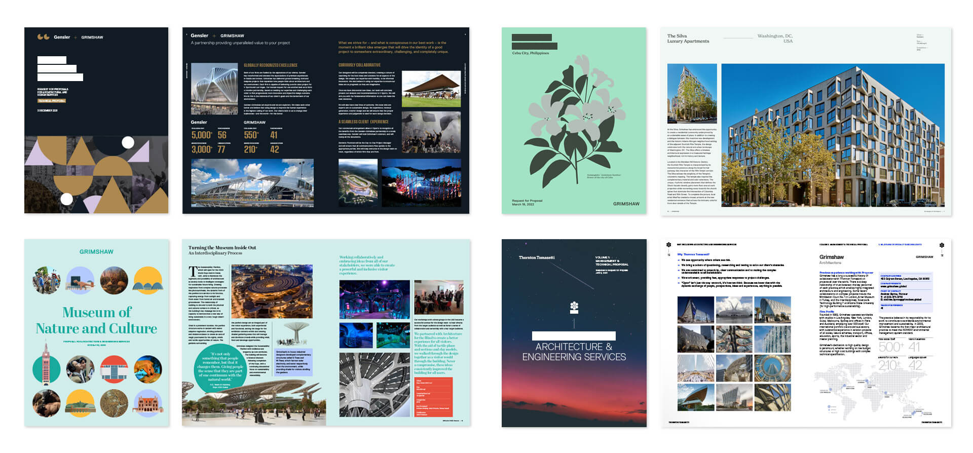
The grid system offers opportunity for strong but flexible layout designs for official brochures and documentation. At the same time, the same grid is used in more tailored and project specific documents, allowing use of different typefaces and graphic elements but making easy to design and edit previous content into a new design.
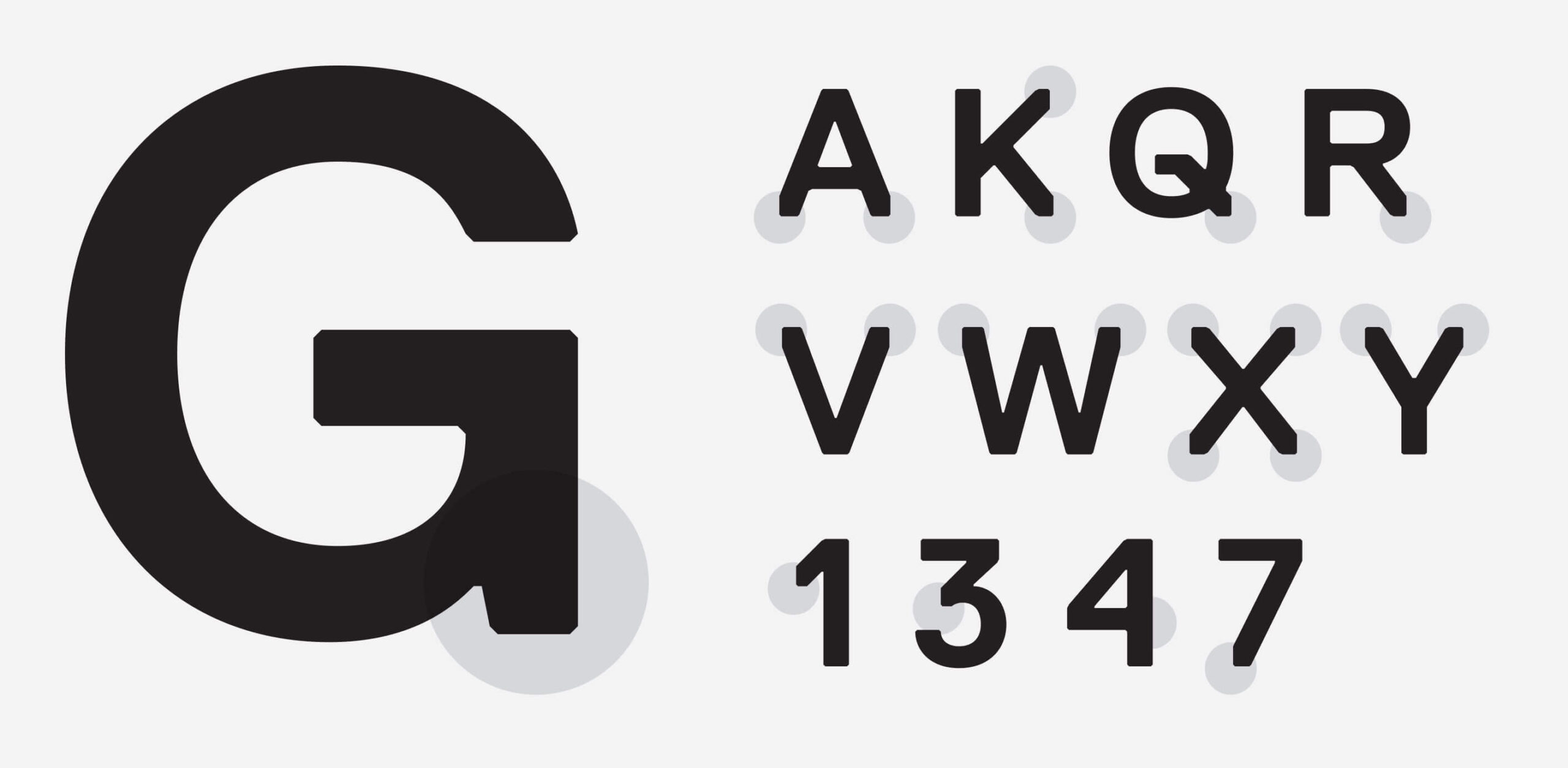
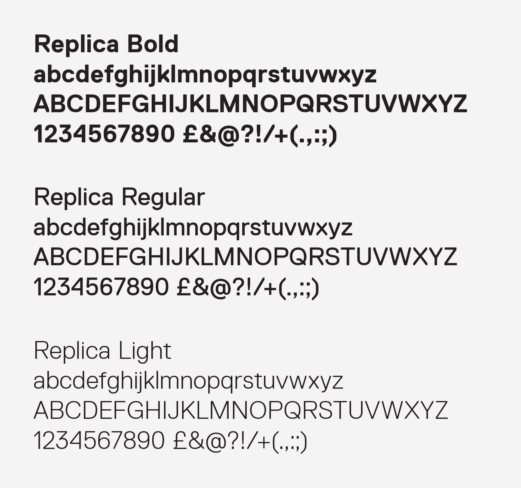
Grimshaw’s new corporate font is Replica. Constructed to a strict grid system, its edges have been cut away to make a symmetrical sloping edge. This sense of structure and order represents the company’s architectural design values perfectly.
For the next branding stage I concentrated on Grimshaw’s website, translating the grid system and keeping the same hierarchy and values that are used all across its publications. The grid allows for a clear but flexible page building tool that helps for an emphasis on storytelling, illustrating the craft and people that make their projects.
